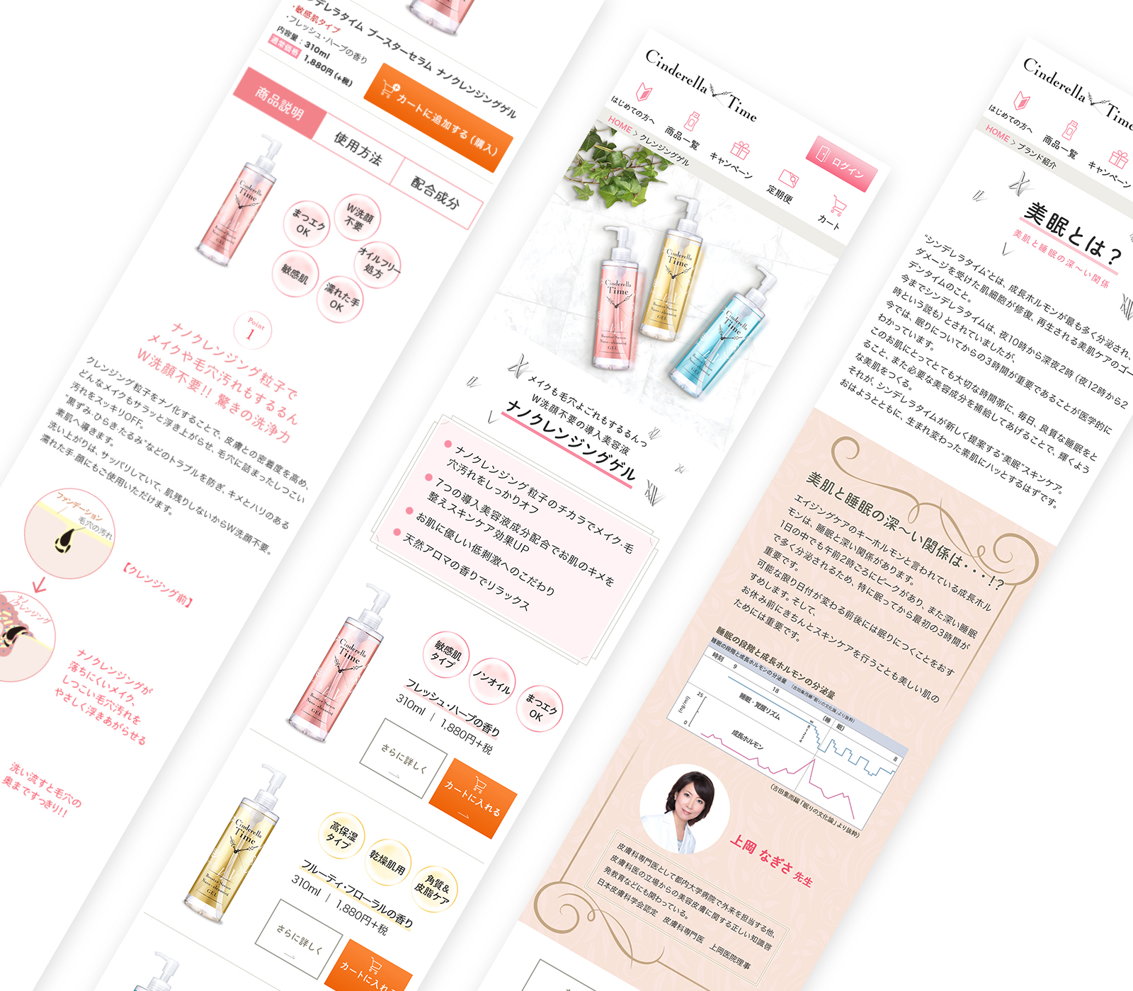
成分ホルモンがもっとも多く分泌される、美肌タイム=“シンデレラタイム” に着目し誕生した、スキンケアのブランドサイトのデザイン。
ロゴとパッケージは既存のまま。無添加処方で肌にやさしい成分のみでつくられた化粧品のイメージを損なわない、シンプルかつキレイ目なデザインに。
俗に “お肌の曲がり角” と言われる20〜30代女性のことを1番に想い、開発・製造されてきたクライアントさまでしたので、伝えたいメッセージをしっかりとご教示くださったおかげで、良いクリエイティブになりました。
—
Designed for a skincare brand site that was born with a focus on “Cinderella Time”, the skin beautifying time where most of the component hormones are secreted.
The logo and package remain existing. Made with only ingredients that are gentle to the skin and are additive-free. A simple and clean design that does not impair the image of cosmetics.
The logo and package remain existing. Made with only ingredients that are gentle to the skin and are additive-free. A simple and clean design that does not impair the image of cosmetics.